
Disclaimer: The toy datasets are meant to be used only for educative purposes and do not reflect real world cases.
Setting your drive folder
Before starting the lesson, you have to save on your personal google drive the folder where this document is stored. You can run this procedure only once.
- Sign in to your personal Google Drive account
- Go to
Shared with me - Right-click on the
CM0492_AI_ML_PRfolder - Select
Add shortcut to Drive>My Drive - Click on
ADD SHORTCUT
Mount the Drive on Colab
Now, mount your personal Drive by executing the following snippet of code:
from google.colab import drive
drive.mount('/content/drive')
and follow these instructions:
- Execute the code (SHIFT + Enter)
- Follow the link displayed in the cell output
- Choose your preferred Google account and click
Consent - Copy the displayed code and paste in the previous cell output
In addition, let’s define the dataset folder path (change it accordingly to your Google Drive path).
path = "drive/MyDrive/University/Courses/CM0492_AI_ML_PR/Students/datasets/"
Regression models are statistical methods invented in the 19th century and successively incorporated in machine learning algorithms. In spite of the name, some regression models are applied in classification tasks. Unfortunately, the nomenclature creates confusion…
Linear Regression
The linear regression model has been invented to solve regression problems that follow a linearity principle. In other words, if the observations are distributed around a line, the linear regression model is a method of choice! In spite of its simplicity, it is still one of the most utilized models
Exercise 1: Line Function (1m)
The linear regression model is substantially represented by a line1:
$$y = mx + q$$
$m$ is the angular coefficient (slope, bias) determining the direction of the line. $q$ is the intercept, determining the crossing point with the $y$ axis.
Try to define a function line, taking in input three arguments x, m, q
and returning in output the corresponding $y$ value.
Solution
def line(x, m, q):
  return m * x + q
Exercise 2: line plot (5m)
Try to plot with a line with $m = 3$, $q = 0$. Use the seaborn package which
contains a variety of functions to draw different kinds of charts. lineplot
plots a segment with specified coordinates $(x_0, y_0)$, $(x_1, y_1)$.
import seaborn as sns
sns.lineplot(x=(x0, x1), y=(y0, y1)`
Choose x0=0, x1=1 and compute y0, y1, with the previously defined
line function. Try to change the value of m and q, and notice how the
plot changes.
Solution
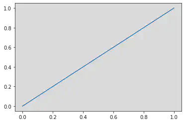
import seaborn as sns
m, q = 1, 0
x0, x1= 0, 1
y0, y1 = line(x0, m, q), line(x1, m, q)
g = sns.lineplot(x=(x0, x1), y=(y0, y1))
Try to change m and use negative or null values. Similarly, change q and
try to understand how the plot change (always pay attention to the cartesian
axes).
Good job! You have just created your first linear regression model! 🎉
Dataset print and plot
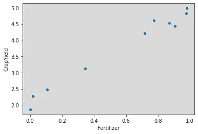
Now, let’s load, print and plot a dataset. We will work with the “CropYield”
toy dataset, containing two variables: Fertilizer and CropYield.
To load the dataset, you can use the pandas library.
import pandas as pd
yields = pd.read_csv(path + "CropYield/train.csv")
yields
| Fertilizer | CropYield | |
|---|---|---|
| 0 | 0.775087 | 4.602105 |
| 1 | 0.107735 | 2.479954 |
| 2 | 0.002930 | 1.865183 |
| 3 | 0.872268 | 4.522621 |
| 4 | 0.906543 | 4.432467 |
| 5 | 0.979126 | 4.977277 |
| 6 | 0.716126 | 4.204970 |
| 7 | 0.345625 | 3.117627 |
| 8 | 0.976285 | 4.827207 |
| 9 | 0.016963 | 2.279666 |
yields is a DataFrame object, which contain useful methods to efficiently
manage datasets. For example, you can plot it by calling the following method:
yields.plot.scatter(x="Fertilizer", y="CropYield")
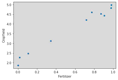
Alternatively, you can use seaborn
sns.scatterplot(data=yields, x="Fertilizer", y="CropYield")
Our aim consists of predicting the yield (CropYield) from the quantity of
fertilizer used (Fertilizer).
Note that the observations are noisy and we can choose multiple lines to fit
the data. How can we decide the optimal values for m and q?
We use a procedure called Ordinary Least Squares, which is implemented in the
library scikit-learn.
scikit-learn
scikit-learn (sklearn), is a Python
library that implements traditional machine learning models. Some of them
have a fit method that takes a supervised set of observations X and y,
and learns the optimal parameters for the model to correctly predict an input.
In our case, the linear regression model is implemented in the
LinearRegression class.
from sklearn.linear_model import LinearRegression
model = LinearRegression()
X = yields[["Fertilizer"]]
y = yields["CropYield"]
model.fit(X, y)
LinearRegression()
The parameters are then saved inside the attribute coef_ ($m$) and
intercept_ ($q$).
print(f"m = {model.coef_}, q = {model.intercept_}")
m = [2.85208755], q = 2.10559186972041
Exercise 3: plotting the dataset and the model (3m)
Now, try to plot the dataset and the linear model using the functions
previously used (carefully check the coef_ parameter). To plot two charts in
the same figure, it is sufficient to call the two corresponding plot functions
in the same notebook cell. seaborn will take care to manage the combined
plot.
Solution
yields.plot.scatter(x="Fertilizer", y="CropYield")
m, q = model.coef_[0], model.intercept_
x0, x1 = 0, 1
y0, y1 = line(0, m, q), line(1, m, q)
sns.lineplot(x=(x0, x1), y=(y0, y1), color="r")
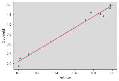
Not bad! But how can we measure the performance of our model? We can use the coefficient of determination $R^2$:
$$R^2 = 1 - \frac{RSS}{TSS}$$
- $RSS = \sum_i^n (y_i - \hat{y}_i)^2$ is the Residual Sum of Squares. It measures how much the predicted values $\hat{y}_i$ differ from the real values $y_i$.
- $TSS = \sum_i^n (y_i - \bar{y})^2$ is the Total Sum of Squares. It measures how much the real values $y_i$ differ from their mean $\bar{y}$.
Note that $-\infty \le R^2 \le 1$.
- A value of $1$ indicates that the model fitted the data very well
- A value of $0$ indicates that the performance of the model are comparable to that of a dummy model that simply predicts $\hat{y}_i = \bar{y}$ (so the performance is very bad)
- A negative value indicates that the model perform even worse than the dummy model
scikit-learn provides a formula to compute $R^2$. You can access it through
model.score.
trscore = model.score(X, y)
trscore
0.979817775280037
We computed the coefficient of determination on the train set, which is the data used for training the model. This practice is ~discouraged~ prohibited, because it leads us to incorrect interpretations of our model2.
The correct method consists of testing our model performance on a test set, that is, a set of data never seen by the algorithm. In machine learning, this is the standard method of evaluation and it is basically applied on every model.
N.B. Before the training, always remember to partition your dataset in3:
- train set used for the model training
- test set used for the model testing
Exercise 4 (5m): train/test set plot and score
In our case, the test set is CropYield/test.csv.
Try to:
- Plot the train (in blue) and the test (in green) sets
- Plot one more time the trained model (in red)
- Compute the coefficient of determination on the test set
N.B. To plot two charts on the same figure with DataFrame.plot, you have to use the following snippet:
import matplotlib.pyplot as plt
ax = plt.gca()
dset1.plot.scatter(..., ax=ax)
dset2.plot.scatter(..., ax=ax)
...
Solution
import matplotlib.pyplot as plt
ax = plt.gca()
ts_yields = pd.read_csv(path + "CropYield/test.csv")
yields.plot.scatter(x="Fertilizer", y="CropYield", color="b", ax=ax)
ts_yields.plot.scatter(x="Fertilizer", y="CropYield", color="g", ax=ax)
sns.lineplot(x=(x0, x1), y=(y0, y1), color="r")
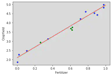
tsscore = model.score(ts_yields[["Fertilizer"]], ts_yields["CropYield"])
tsscore
0.7499244074318637
If you want to obtain the numerical values $\hat{y}_i$ you can use
model.predict.
model.predict(ts_yields[["Fertilizer"]])
array([3.87409725, 2.84879106, 3.83247968, 3.87859246])
Exercise 5: Bonus (15m)
Try to run a complete analysis on the tips dataset, using the linear regression model. The dataset can be loaded with sns.load_dataset("tips"). The variables to be investigated are total_bill ($x$), and tip ($y$).
You can split the dataset in 80% train and 20% test with the sklearn.model_selection.train_test_split function.
Additional Details
- The formula of the linear regression model presented above is partial. Its
complete form is as follows:
$$y_i = m x_{i1} + q + \epsilon_i$$
where $y_i$ is the predicted variable (
CropYield), $x_{i1}$ is the predictor (Fertilizer) and $\epsilon_i$ is the noise in the measurement of $y_i$, that makes the observation deviate from the linear model. In particular, $\epsilon_i$ is a random variable distributed according to a Gaussian with mean $0$, that is $\epsilon_i \sim N(0, \sigma^2)$. - It is possible to include more predictors in a regression model, if they are
available. In this case we speak about multiple regression and the model
can be expressed through the following formula:
$$y_i = w_1x_{i1} + \dots + w_m x_{im} + \epsilon_i = \vec{w}^\top\vec{x}_i +
\epsilon_i$$
The code almost does not change, and you can still use the
LinearRegressionclass. However, it is more difficult to display visualizations of the model because more than two variables come into play.
Non-linear regression
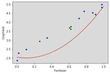
Why stopping at lines when you can use generic curves? For example, we can use the following model:
$$y = a x^2 + b x + c$$
that represents a parabola, or increase the degree of the polynomial, using functions with $x^3$, $x^4$, …
We can do it in Python, by first using
sklearn.preprocessing.PolynomialFeatures that has a method to process a
variable $x$, returning a matrix of values containing $x$, $x^2$, $x^3$, …
The degree is controlled by the parameter degree.
values = np.array(yields[["Fertilizer"]])
values
array([[0.77508669],
       [0.10773476],
       [0.00293029],
       [0.87226816],
       [0.90654301],
       [0.97912617],
       [0.71612597],
       [0.3456249 ],
       [0.97628547],
       [0.01696288]])
from sklearn.preprocessing import PolynomialFeatures
poly2 = PolynomialFeatures(degree=2, include_bias=False)
squares = poly2.fit_transform(yields[["Fertilizer"]])
squares
array([[7.75086687e-01, 6.00759372e-01],
       [1.07734756e-01, 1.16067776e-02],
       [2.93028665e-03, 8.58657984e-06],
       [8.72268163e-01, 7.60851748e-01],
       [9.06543012e-01, 8.21820233e-01],
       [9.79126169e-01, 9.58688056e-01],
       [7.16125974e-01, 5.12836411e-01],
       [3.45624901e-01, 1.19456572e-01],
       [9.76285475e-01, 9.53133328e-01],
       [1.69628808e-02, 2.87739324e-04]])
poly3 = PolynomialFeatures(degree=3, include_bias=False)
cubes = poly3.fit_transform(yields[["Fertilizer"]])
cubes
array([[7.75086687e-01, 6.00759372e-01, 4.65640591e-01],
       [1.07734756e-01, 1.16067776e-02, 1.25045335e-03],
       [2.93028665e-03, 8.58657984e-06, 2.51611403e-08],
       [8.72268163e-01, 7.60851748e-01, 6.63666757e-01],
       [9.06543012e-01, 8.21820233e-01, 7.45015390e-01],
       [9.79126169e-01, 9.58688056e-01, 9.38676563e-01],
       [7.16125974e-01, 5.12836411e-01, 3.67255474e-01],
       [3.45624901e-01, 1.19456572e-01, 4.12871660e-02],
       [9.76285475e-01, 9.53133328e-01, 9.30530223e-01],
       [1.69628808e-02, 2.87739324e-04, 4.88088785e-06]])
Try to train the quadratic model with the features squares. You can still use
LinearRegression (even if the learned model is no more “linear”).
lr2 = LinearRegression()
lr2.fit(X=squares, y=yields["CropYield"])
lr2.coef_, lr2.intercept_
(array([ 3.59243984, -0.76047643]), 2.044112084738092)
def parabola(x, a, b, c):
  return a * x ** 2. + b * x + c

a, b = lr2.coef_
c = lr2.intercept_
xs = np.linspace(0, 1, 1000)
ys = parabola(xs, a, b, c)

def plot_data(xs, ys):
  ax = plt.gca()
  yields.plot.scatter(x="Fertilizer", y="CropYield", color="b", ax=ax)
  ts_yields.plot.scatter(x="Fertilizer", y="CropYield", color="g", ax=ax)
  sns.lineplot(x=xs, y=ys, color="r")

plot_data(xs, ys)
trscore2 = lr2.score(X=squares, y=yields["CropYield"])
tsscore2 = lr2.score(X=poly2.fit_transform(ts_yields[["Fertilizer"]]), y=ts_yields["CropYield"])
print(f"Linear model performance - train: {trscore}, test: {tsscore}")
print(f"Quadratic model performance - train: {trscore2}, test: {tsscore2}")
Linear model performance - train: 0.979817775280037, test: 0.7499244074318637
Quadratic model performance - train: 0.9826137824834141, test: 0.4320272917743925
You can notice that the train set score has slightly improved in the quadratic model, while that of of the test set has hugely worsened. This phenomenon is called overfitting, that is, our model is fitting too well the training data and is no more able to generalize to the unseen test data. For this reason, it is fundamental to test your own model on data that has not been used during the training phase.
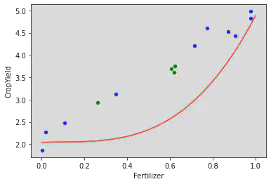
Exercise 6: Cubic regression (5m)
Try to repeat the previous analysis with cubes.
Solution
lr3 = LinearRegression()
lr3.fit(X=cubes, y=yields["CropYield"])

def cubic_curve(x, a, b, c, d):
  return a * x ** 3. + b * x ** 2. + c * x + d

a, b, c = lr3.coef_
d = lr3.intercept_
xs = np.linspace(0, 1, 1000)
ys = cubic_curve(xs, a, b, c, d)

plot_data(xs, ys)
trscore3 = lr3.score(X=cubes, y=yields["CropYield"])
tsscore3 = lr3.score(X=poly3.fit_transform(ts_yields[["Fertilizer"]]), y=ts_yields["CropYield"])
print(f"Linear model performance - train: {trscore}, test: {tsscore}")
print(f"Quadratic model performance - train: {trscore2}, test: {tsscore2}")
print(f"Cubic model performance - train: {trscore3}, test: {tsscore3}")
Linear model performance - train: 0.979817775280037, test: 0.7499244074318637
Quadratic model performance - train: 0.9826137824834141, test: 0.4320272917743925
Cubic model performance - train: 0.982620965087488, test: 0.4379484053312923
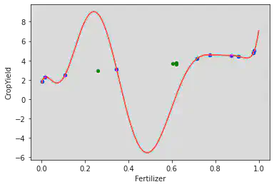
Exercise 7: Regression of degree 10 (5m)
Repeat the analysis with a polynomial of degree $10$. To plot the model, use the following function.
def poly_curve(x, coef, intercept, degree):
  powers = np.array([x ** (n + 1) for n in range(degree)])
  return coef @ powers + intercept
Solution
poly10 = PolynomialFeatures(degree=10, include_bias=False)
deg10 = poly10.fit_transform(yields[["Fertilizer"]])

lr10 = LinearRegression()
lr10.fit(X=deg10, y=yields["CropYield"])

xs = np.linspace(0, 1, 1000)
ys = poly_curve(xs, lr10.coef_, lr10.intercept_, 10)

plot_data(xs, ys)
trscore10 = lr10.score(X=deg10, y=yields["CropYield"])
tsscore10 = lr10.score(X=poly10.fit_transform(ts_yields[["Fertilizer"]]), y=ts_yields["CropYield"])
print(f"Linear model performance - train: {trscore}, test: {tsscore}")
print(f"Quadratic model performance - train: {trscore2}, test: {tsscore2}")
print(f"Cubic model performance - train: {trscore3}, test: {tsscore3}")
print(f"10 degree model performance - train: {trscore10}, test: {tsscore10}")
Linear model performance - train: 0.979817775280037, test: 0.7499244074318637
Quadratic model performance - train: 0.9826137824834141, test: 0.4320272917743925
Cubic model performance - train: 0.982620965087488, test: 0.4379484053312923
10 degree model performance - train: 1.0, test: -165.67305678062633
Logistic Regression
In spite of its name, the logistic regression model is used to solve classification problems. First of all, take confidence with the dataset we are going to use.
Load the toy dataset HeartDisease/train.csv that contains data on the
presence of Cholesterol in the blood Cholesterol and on the presence of heart
diseases Disease.
heart = pd.read_csv(path + "HeartDisease/train.csv")
heart
| Cholesterol | Disease | |
|---|---|---|
| 0 | 0.907229 | 1.0 |
| 1 | 0.335181 | 0.0 |
| 2 | 0.857557 | 1.0 |
| 3 | 0.105586 | 0.0 |
| 4 | 0.598201 | 1.0 |
| 5 | 0.557790 | 1.0 |
| 6 | 0.838240 | 1.0 |
| 7 | 0.367461 | 0.0 |
| 8 | 0.305634 | 0.0 |
| 9 | 0.120418 | 0.0 |
| 10 | 0.455947 | 0.0 |
| 11 | 0.156718 | 0.0 |
| 12 | 0.209443 | 0.0 |
| 13 | 0.689115 | 1.0 |
| 14 | 0.873233 | 1.0 |
heart.plot.scatter(x="Cholesterol", y="Disease")
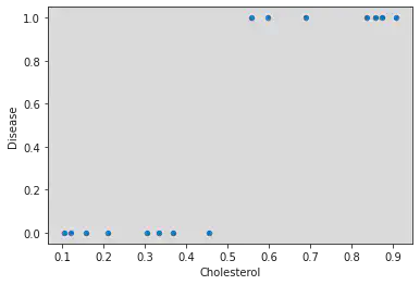
As you can see, the important difference with the previous datasets resides in the predicted value, which is binary. The linear regression model does not work well in this case.
ts_heart = pd.read_csv(path + "HeartDisease/test.csv")
linreg = LinearRegression()
linreg.fit(heart[["Cholesterol"]], heart["Disease"])
m, q = linreg.coef_[0], linreg.intercept_
x0, x1 = 0, 1
y0, y1 = line(x0, m, q), line(x1, m, q)

def plot_data(xs, ys):
  ax = plt.gca()
  heart.plot.scatter(x="Cholesterol", y="Disease", color="b", ax=ax)
  ts_heart.plot.scatter(x="Cholesterol", y="Disease", color="g", ax=ax)
  sns.lineplot(x=xs, y=ys, color="r")

plot_data(xs=(x0, x1), ys=(y0, y1))
linreg.score(ts_heart[["Cholesterol"]], ts_heart["Disease"])
0.7587157885934852
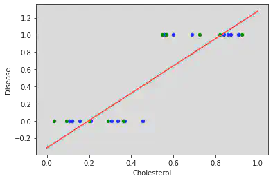
Luckily, it is possible to imporve the classification performance using the logistic regression.
The model is simple and adopts the sigmoid function:
$$\sigma(x) = \frac{1}{1 + e^{-x}}$$
with $e$ being the
Euler number.
You can use numpy.exp(x) to compute it
Exercise 8: Sigmoid plot (3m)
Define and plot the the sigmoid function in the interval $[-10, 10]$. Once you define curve, you can plot it with the following code:
xs = np.linspace(start=-10, stop=10, num=1000)
ys = sigmoid(xs)
sns.lineplot(x=xs, y=ys)
The linspace function takes in input two values start and stop specifying
an interval and outputs num equispaced values within that interval. Try to
print some examples to understand how it can be used.
Solution
def sigmoid(x):
  return 1. / (1. + np.exp(-x))

xs = np.linspace(-10, 10, 1000)
sns.lineplot(x=xs, y=sigmoid(xs))
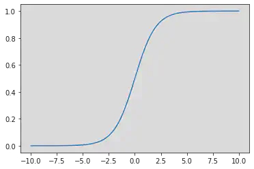
The function has the typical “S”-like shape (that is why it is called “sigmoid”) and its $y$ range is from $0$ to $1$. This allow us to better model our classification problem.
The logistic regression model is as simple as applying the sigmoid function to a linear regression mode, in this way:
$$\mathbb{P}(y = 1 | x) = \frac{1}{1 + e^{-(mx + q)}}$$
$\mathbb{P}(y = 1 | x)$ is the probability that $y = 1$ knowing the value $x$. $y$ is then estimated in the following way:
$$ % \begin{equation*} y = \begin{cases} 1 & \text{if }\ \mathbb{P}(y = 1 | x) \ge 0.5\\ 0 & \text{else} \end{cases} % \end{equation*} $$
In scikit-learn the logistic regression model is implemented under the name
sklearn.linear_model.LogisticRegression, and it has the same methods of the
linear regression model.
Exercise 9: Analysis with logistic regression (15m)
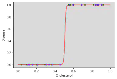
Run the analysis of the dataset with the logistic regression model. Plot the
train/test sets and function $\mathbb{P}(y = 1 | x)$. Then, compute the score
over the train/test sets. Instantiate the model in this way:
logreg = LogisticRegression(penalty='none'). You can use the functions
plot_data, sigmoid and line.
Solution
from sklearn.linear_model import LogisticRegression

logreg = LogisticRegression(penalty="none")
logreg.fit(heart[["Cholesterol"]], heart["Disease"])
trscore = logreg.score(heart[["Cholesterol"]], heart["Disease"])
tsscore = logreg.score(ts_heart[["Cholesterol"]], ts_heart["Disease"])
print(f"Logistic model performance - trscore: {trscore}, tsscore: {tsscore}")


def log_curve(x, m, q):
  return sigmoid(line(x, m, q))

m, q = logreg.coef_[0], logreg.intercept_
xs = np.linspace(0, 1, 1000)
ys = log_curve(xs, m, q)
plot_data(xs, ys)
Logistic model performance - trscore: 1.0, tsscore: 1.0
Exercise 10 (Bonus): Iris dataset
The logistic regression can be used for multiclass classification! Try to use
it with the Iris dataset that you have seen in the first lesson. The dataset
contains three classes iris_setosa, iris_virginica, iris_versicolor.
Split the dataset in 80% train 20% test (use
sklearn.model_selection.train_test_split) and then analyze!